
Website design doesn’t have to be complicated. We at Pluginizer believe that seeing real Elementor examples in action is the fastest way to understand what’s possible with the platform.
This post shows you websites that actually work, the design choices that make them effective, and how to apply those same strategies to your own site.
What High-Performing Elementor Websites Have in Common
Portfolio sites built with Elementor succeed because they prioritize image quality and responsive behavior across devices. Photographers and creative professionals use full-width galleries, minimal navigation, and bold typography to showcase work without distraction. E-commerce stores on Elementor leverage WooCommerce integration to display products with multiple angles, detailed descriptions, and customer reviews positioned prominently. The design pattern works because it reduces friction in the buying decision. Corporate websites designed with Elementor typically combine clear value propositions with structured layouts that guide visitors toward specific actions, whether that’s scheduling a demo or downloading resources. These sites perform well because they balance visual appeal with functional clarity, avoiding the trap of choosing style over usability.
Responsive Design Matters More Than Visual Complexity
Mobile traffic accounts for over 50 percent of web traffic globally, yet many Elementor sites still prioritize desktop aesthetics first. The best-performing examples reverse this approach. They start with mobile layouts and expand upward, ensuring touch-friendly buttons, readable text at small sizes, and fast load times on slower connections. Elementor’s responsive controls let you adjust spacing, font sizes, and element visibility across breakpoints without code. Sites that apply these controls rigorously see better engagement metrics and lower bounce rates than those that ignore mobile optimization.
Interactive Elements Drive Engagement Without Slowing Performance
Animations, hover effects, and dynamic content reveal boost user engagement when you implement them thoughtfully. Elementor’s motion effects library includes scroll-triggered animations, parallax backgrounds, and element transitions that work on most modern browsers. The key is restraint. Sites that animate every element feel cluttered and slow. Sites that animate one or two critical elements (like a call-to-action button or a product image on hover) guide attention effectively and maintain page speed. Test page load time before and after you add effects to identify which animations justify their performance cost.
Design Patterns That Convert Visitors Into Customers
High-performing sites share specific layout patterns that reduce decision fatigue. Clear visual hierarchy directs visitors to the most important information first. Bold, full-bleed hero sections with a single call-to-action guide users toward the next step without overwhelming them.
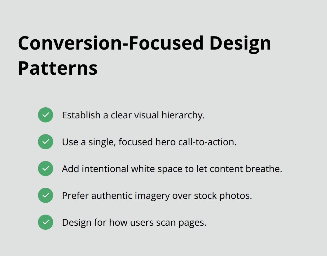
White space (not empty space, but intentional breathing room) lets key messages and products stand out. Authentic imagery beats stock photos for building trust and telling your brand story. These patterns work across industries because they respect how visitors actually scan and interact with web pages.
What Separates Mediocre Designs From Exceptional Ones
The difference often comes down to attention to detail. Distinctive typography and color choices help you stand out in crowded markets. High-quality photography conveys origin, craft, and exclusivity in ways generic visuals cannot. Customer testimonials and case studies positioned prominently boost credibility. Sites that combine these elements create immersive brand experiences that foster engagement and loyalty. The next section shows you how to identify which design strategies fit your specific goals and audience.
What Makes Elementor Designs Stand Out Visually
Mobile-First Design Creates the Foundation
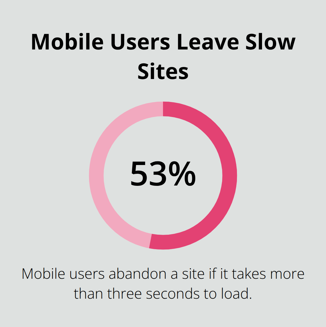
The websites that catch attention in Elementor galleries share three deliberate choices: they treat mobile as the primary design canvas, they use typography and color to create unmistakable brand identity, and they add movement only where it matters. Responsive design isn’t optional anymore-it’s the foundation. Sites that perform well start by defining how content stacks on a 320px smartphone screen, then expand outward to tablets and desktops. You can hide elements, adjust spacing, and resize typography for each breakpoint without touching code. A fashion retailer might hide secondary navigation on mobile to focus attention on product images and the shopping cart button. A corporate site might collapse a three-column footer into a single column on phones. This approach matters because 53% of mobile users will abandon a site that takes more than three seconds to load.
Typography and Color Shape Brand Recognition
Typography choices separate professional sites from amateur ones. Bold, distinctive fonts paired with strong hierarchy guide visitors through your message. Sites that win awards often use a maximum of two typeface families-one for headings and one for body text. Color schemes need restraint too. The best Elementor examples use a primary color for calls-to-action and key elements, a secondary color for accents, and a neutral palette for backgrounds and text. This prevents visual chaos and trains visitor attention on what matters.
Motion Effects Amplify Without Distracting
Interactive elements should amplify the user experience, not distract from it. Hover effects on product images, scroll-triggered animations on testimonials, and smooth transitions between sections feel modern when implemented sparingly. A product detail page might use a parallax effect on the hero image to create depth, but the rest of the page stays still so users can focus on reading specifications and reviews. Motion effects and animations can enhance user experience and improve engagement when used purposefully. The trap most designers fall into is treating animations as decoration. They’re not. Each animation should either guide attention toward a conversion goal or improve comprehension of content. Test your site’s page speed before and after adding effects-if load time increases significantly, remove the animation or optimize the asset triggering it.
Putting Principles Into Practice
Sites built with responsive design, intentional typography and color, and purposeful motion consistently outperform sites that ignore these principles. The next section walks you through applying these strategies to your own project, starting with how to choose templates that align with your vision.
Building Your Site Without Starting From Scratch
Choose Templates That Match Your Industry
Start with a template that matches your industry, not your aesthetic preferences. Elementor offers 100+ responsive website kits across portfolio, e-commerce, corporate, and service-based categories. Most designers treat templates as final designs when they should treat them as structural foundations that drastically cut production time. A photography business owner selects a portfolio template with a gallery-focused layout, then swaps in their images and adjusts the color palette to match their brand. An online store operator picks a WooCommerce template that displays product images prominently and includes customer review sections. The template handles responsive behavior, section spacing, and element alignment automatically. Your job is to customize it.
Customize at the Detail Level, Not the Structure Level
Elementor’s drag-and-drop interface lets you move sections, resize elements, and change typography without code. Change the headline font to something distinctive for your brand. Adjust the primary color from the template’s default to your brand color. Upload your logo and swap placeholder images with your own photography. Remove sections that don’t serve your specific goal. A SaaS company might delete the testimonials section if they lack customer reviews yet and replace it with a detailed features breakdown instead. Templates enforce design best practices you might otherwise overlook-a corporate template includes a clear call-to-action above the fold, a features section with icon and text pairing, a testimonials carousel, and a contact form. These sections exist because they drive conversions. Skipping them to create a completely custom design often results in weaker performance.
Test on Mobile Devices Before Publishing
Test your changes on mobile devices before publishing. Open your site on an actual smartphone or use browser developer tools to simulate different screen sizes. Check that buttons remain clickable, text remains readable at small sizes, and images don’t distort. Elementor’s responsive controls let you hide elements on mobile if they clutter the layout. A navigation menu with eight items collapses into a hamburger menu on phones. A three-column feature section stacks into one column. These adjustments take minutes and dramatically improve mobile performance.
Monitor Performance Metrics and Iterate
After publishing, monitor your site’s performance metrics. Google Analytics shows where visitors spend time and where they leave. If your bounce rate exceeds 50 percent on mobile, your mobile layout needs work. If visitors spend less than 15 seconds on a page before leaving, your headline or hero image isn’t compelling enough.
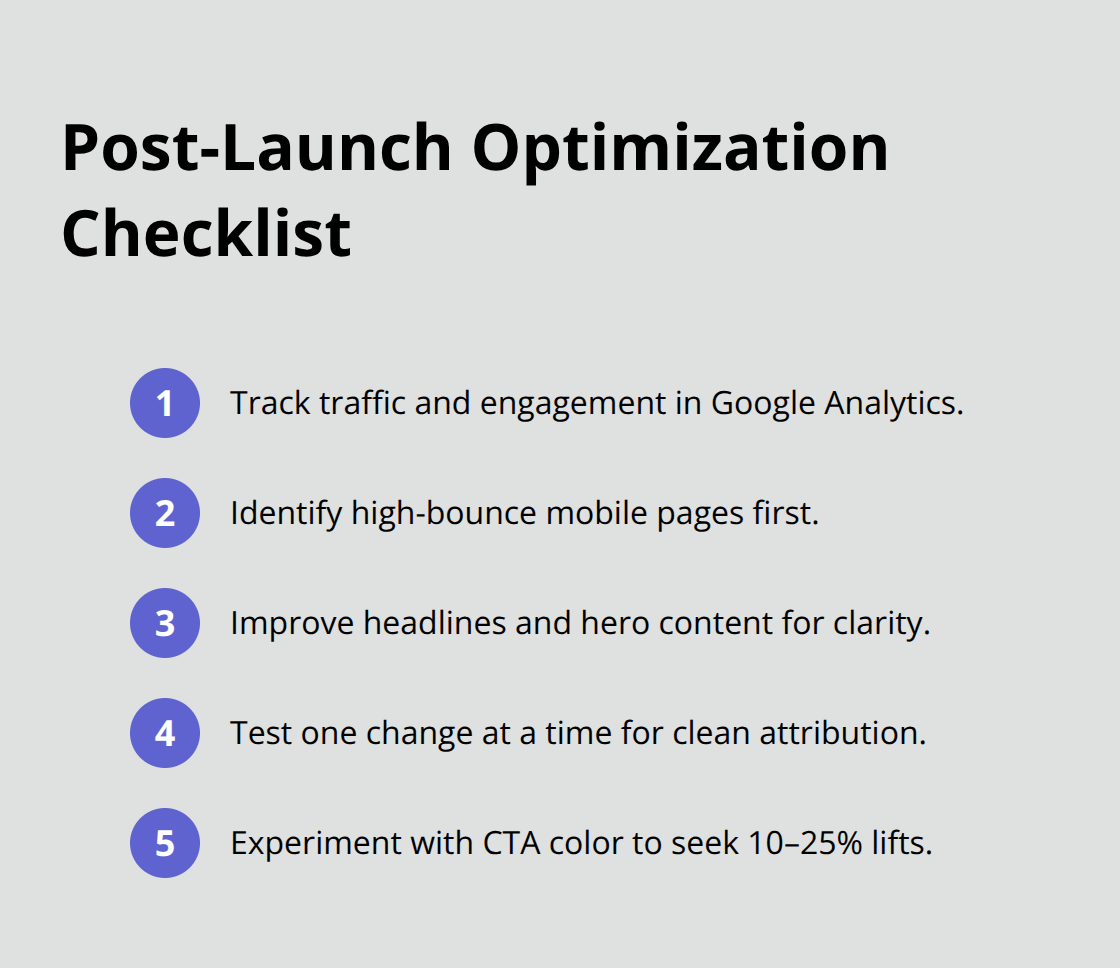
Make one change at a time and measure the impact. Changing your call-to-action button color from blue to red might increase click-through rates by 10 to 25 percent, according to conversion rate optimization studies. That single change compounds across thousands of visitors over months.
Final Thoughts
Effective web design balances visual appeal with functional clarity, as the Elementor examples throughout this post demonstrate. Portfolio sites succeed through image quality and minimal navigation, e-commerce stores convert through product-focused layouts and customer reviews, and corporate websites guide visitors toward specific actions with clear value propositions. These patterns work because they respect how people actually interact with websites.
Implementing these strategies on your own site starts with selecting a template that matches your industry, then customizing it at the detail level rather than rebuilding the structure entirely. Adjust typography and color to reflect your brand, swap placeholder images with your own photography, remove sections that don’t serve your goals, and test everything on mobile devices before publishing. Elementor’s drag-and-drop interface handles responsive design automatically across breakpoints, its motion effects library lets you add purposeful animations without code, and its WooCommerce integration streamlines product pages.
If you manage multiple WordPress sites or need access to premium plugins and themes beyond Elementor, Pluginizer offers unlimited access to over 15,000 premium plugins and themes through a single subscription. Start with one site, apply the design principles covered here, measure the results, and iterate based on what your visitors actually do.