Box Based Responsive WordPress Theme is stylish, customizable, simple, and readable. Perfect for any creative, architect or graphic designer.
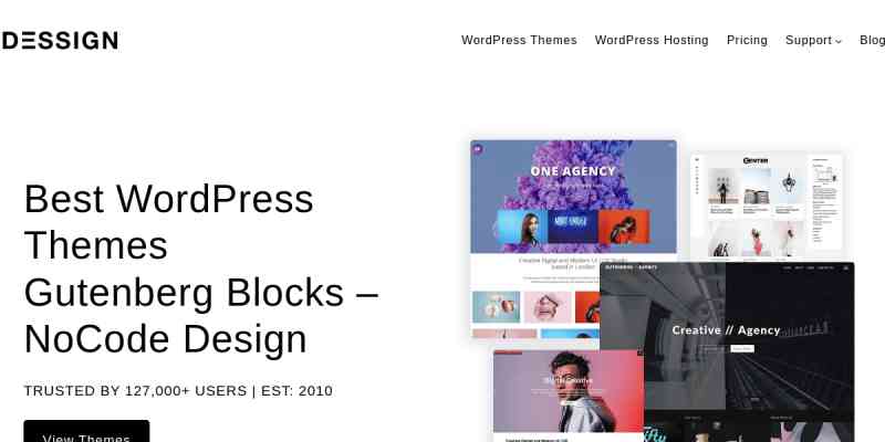
Introducing the Box Grid Responsive WordPress Theme, a sleek and modern theme designed to showcase your content in a visually stunning way. With its clean and minimalist design, this theme is perfect for bloggers, photographers, and creative professionals looking to make a bold statement online.
The Box Grid theme features a unique grid layout that allows you to display your posts and images in a stylish and organized manner. Each box in the grid can be customized to showcase your content, whether it’s a blog post, portfolio item, or a simple image. The responsive design ensures that your website will look great on any device, from desktops to tablets and smartphones.
Customization is a breeze with the Box Grid theme. You can easily change the colors, fonts, and layout to match your brand or personal style. The theme also includes a variety of customization options, such as multiple header styles, custom widgets, and social media integration. With its user-friendly interface and extensive documentation, even WordPress beginners can create a professional and eye-catching website with ease.
Overall, the Box Grid Responsive WordPress Theme is a versatile and powerful theme that combines style and functionality. Whether you’re a blogger, photographer, or creative professional, this theme will help you showcase your content in a visually stunning way. With its easy customization options and responsive design, you can create a website that stands out from the crowd and captivates your audience.